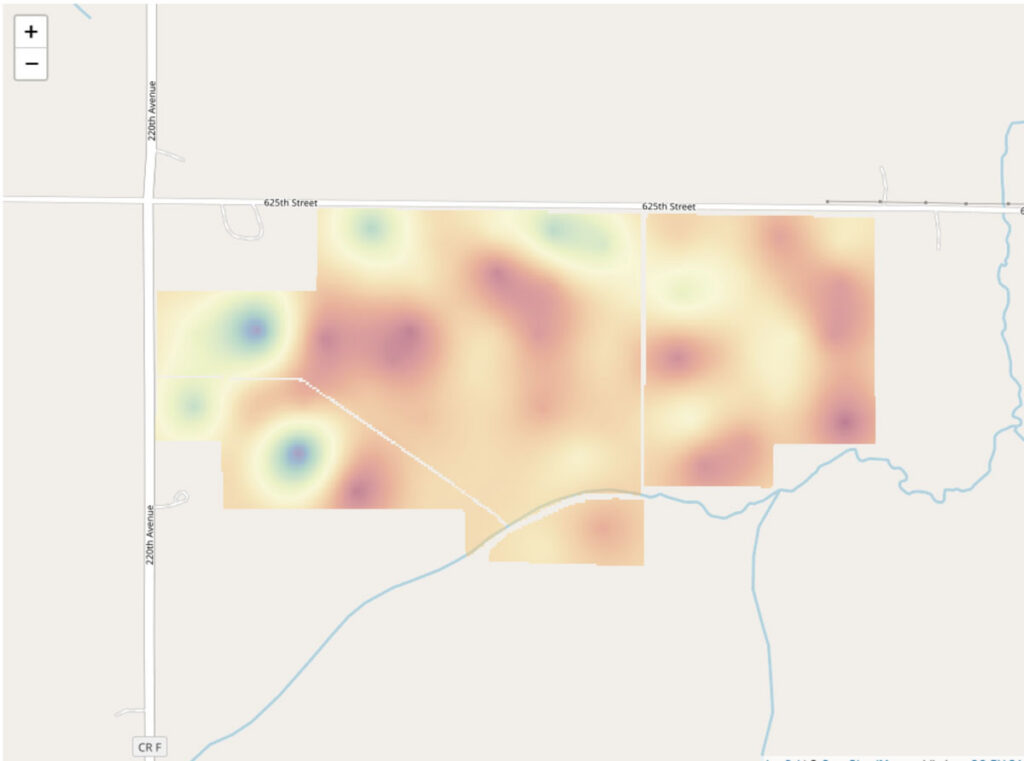
Hundreds of thousand of corn test results that are not being leveraged to grow product sales.
Plants, like humans, require adequate nutrition to survive. Not all soils are alike; texture, organic matter, and chemistry can lead some nutrients to be more scarce than others.
How can we use these data to support customers in their decision to use our products?
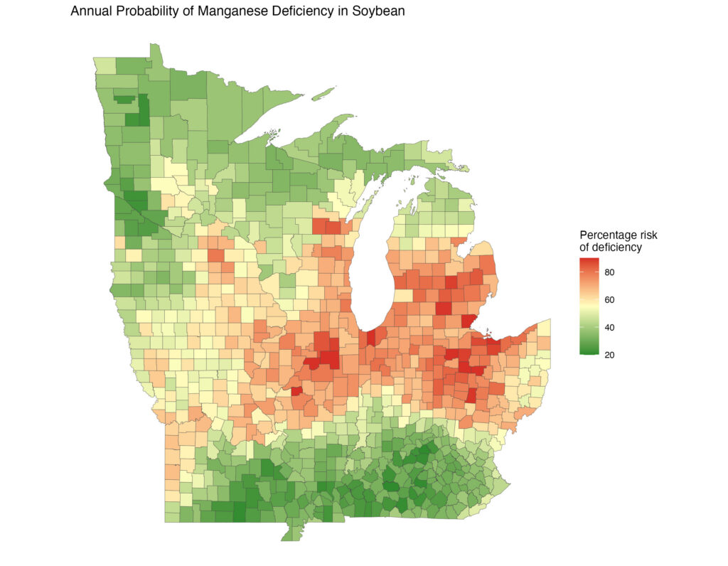
Sample values were paired with soil and weather data engineered from public databases. Machine learning (random forests) were used to generate county level predictions for each year. Finally, these annual predictions were pooled, and the proportion of time a nutrient was deficient was calculated for each county.
Compelling maps in a custom application that helped customers understand the risk of nutrient deficiencies to their corn crop.
Customers increase their purchase of micronutrient and other fertilizers.
A multi-million dollar product testing program struggled with where to place their research sites around the Corn Belt.
Research sites had competing objectives to promote products and provide a range of environments to understand product-by-environment interactions.
How should we locate our research sites to optimally meet competing business and research objectives?
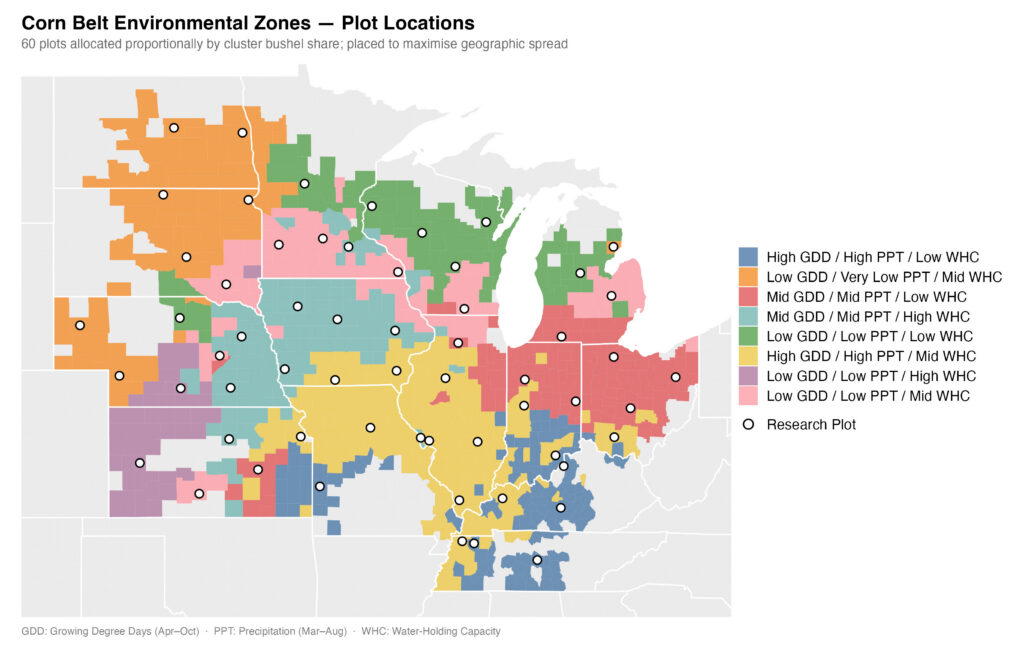
First, we simplified the problem by using a cluster analysis to divide the Midwest into 8 distinct zones, based on environmental characteristics. We then used geospatial statistics to locate customers within each zone, and calculated the sales value of each zone. Finally, research plots were allocated among zones according to their proportion of total sales.
Environmental zones were mapped and distributed to researchers for final selection of sites based on local knowledge, along with the number of research sites they had available to them.
The number of research sites could be decreased — reducing organizational expenses — while better meeting customer and research needs.
New employees struggled to recommend best products to their customers with existing data products
Employee base was shifting from veteran agronomists with vast experience to younger sellers that less or no experience in agriculture. In addition, hybrid entries varied with location and year, preventing comparisons of all appropriate products for a location.
What are the best performing products for each county in the American Midwest. How can new sellers understand both their average performance and performance variability?
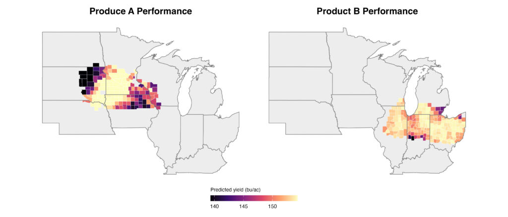
Create an independent model for each product predicting its yield in each US county within it’s testing region. Provide seller with list of products, ranked by their predicted performance and performance variability. Validate model performance working with product experts.
Interactive map that allowed user to either: 1) pick a favorite product and see how it performed within the region in which it was tested; or 2) click on an area within that region and see a performance ranking of all relevant products for that county. Application further explained how product performance was driven by environment.
New sellers were able to identify the most suitable product to maximize performance or manage risk for their customers.
Results turnaround to end end-users was slowed by laborious cleaning approaches that were not repeatable.
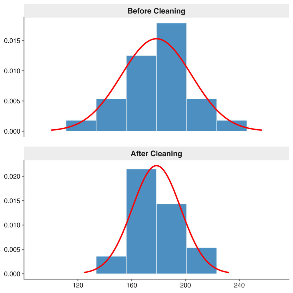
A product testing program conducted many hundreds of field trials locations each year. Each trial was manually cleaned, using only intuition and standard deviations. Not only was this process agonizingly slow; it risked keeping bad data and rejecting good data.
How can we make data ingestion less painful and more effective?
SQL code was scripted to directly ingest data into R environments, reducing the need for manual downloads. New algorithms were written to separate plot error from treatment effects, based on estimates of treatment effects across all locations where that trial was run. New applications were written to replace clumsy software in the SQL front end. Finally, spline model approaches were adapted that automatically identified spatial gradients that were affecting results and adjusted plot estimates to account these trends.
Weeks of manual cleaning were replaced by an algorithm that, in a couple of minutes, cleaned data using a repeatable process and corrected most outliers instead of rejecting them.
Data ingestion was almost instantaneous; cleaned datasets were more balanced, and labor was freed to work on additional projects or learning new data approaches.
Analyses and summaries of field data were slow and laborious. Data segmentation struggled to anticipate user demand.
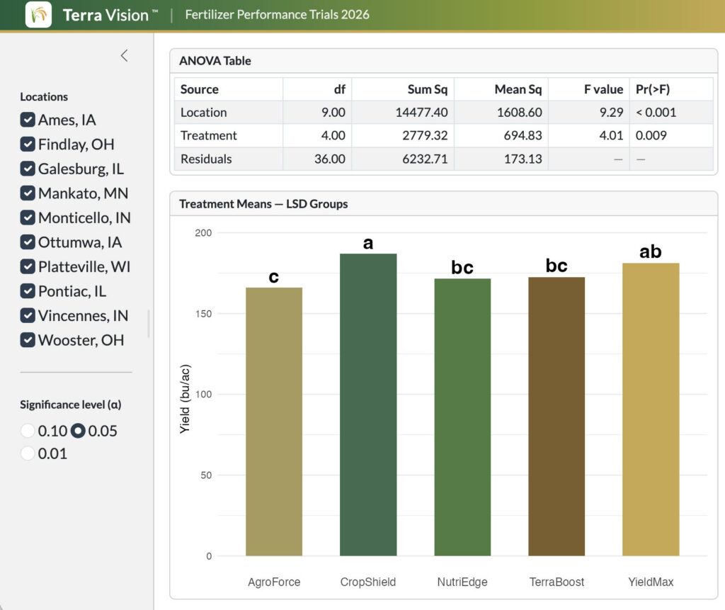
Dozens of field trials, each across many locations, thousands of data points each year. Treatments needed to be analyzed within and across locations; often, users desired ad-hoc groupings of locations that were not foreseen during the original analyses. Slide presentations were created and recreated to meet user needs. This delayed data review and product advancement through research pipelines.
How can we more quickly provide product managers with the specific answers they need to make advancement decisions?
Standard analyses were scripted in R, to map results, test treatments within and across locations, and segment locations according to pre-specified criteria. Soon after, these scripts were embedded in Power BI dashboards to empower users in segmenting results, reducing the need for slide generation. When Power BI proved to slow and limited, self-contained interactive reports were developed in R, containerized in Docker, and moved into production (general use) on a Linux server.
Advanced self-service apps that empowered users to choose how they wanted to segment their data for analyses and what results they shared with others. The containerization of these applications also lent itself to version control and archiving of datasets
Over 50 interactive reports, many built from shared templates, used the time of analysts and researchers more efficiently; this not only saved labor but allowed trial results to be delivered up to a month sooner each year.
A product was not increasing yield enough to pay for itself.
A product applied to soybeans early in their growing season did not result in greater yield. The science behind the product was sound, the ingredients proven to work and, yet, trials did not confirm a positive gain.
How can we explain why a product did or did not increase yield — and better advise customers how to use it.
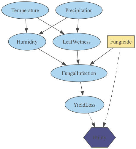
A Bayesian Network is a highly-visual modeling approach that describes the probability that two or more events occur together. One of the powerful features of such a network is that studies can be joined together. Thus, we could use one trial to estimate the likelihood of a 10% increase in plant number when our product was used; and a second trial to estimate the likelihood of a 10% increase in yield in response to a 10% increase in plant number. Because the second dataset measured both plant number and overall yield, a third variable could be engineered: yield per plant.
The Bayesian Network confirmed that an increase in plant number was likely when the product was used. But it also revealed a surprising phenomenon that in retrospect was obvious: when plant number is increased without increasing other inputs, yield per plant decreases and overall productivity changes little.
Researchers learned that early-season inputs cannot be divorced from later season inputs; all must be considered as part of a system so that later inputs protect gains achieved earlier during the season.
Many professionals lack the data literacy to think critically about statistics they are presented with, or to generate their own. Many people are also adverse to math or even intimidated by confusing variables, complex calculations, and the abstraction of results.
Since 1998, Iowa State University has educated thousands of agricultural professionals through its Masters of Agronomy distance-education program. The curriculum includes courses in soil science, plant physiology, climate, pest management — and one historically-feared course in experimental design and analyses.
How can we better engage students in statistics, including scripting, while reducing their stress and improving user recognition of its relevancy to their businesses?
The traditional statistics course was re-written from scratch to provide a how-to course in working with field data. It linked analyses to real world scenarios: yield monitor output, two-product testing, multiple-product tests, optimizing product use rates, working with imperfect data, and communicating results to others through powerful visualizations or maps. A new open-source textbook was created: one that introduced concepts more gradually, explained variables more than once, and focused on training users to be the “grownups in the room” — not just calculators — when data was used, scrutinizing its integrity and even conducting their own analyses instead. The course was made more kinesthetic with applications that demonstrated statistical principles, coding exercises, and instructor videos.
Training textbook, applications, and videos, along with real-time online help sessions.
Hundreds or professionals have completed the course; coarse ratings have soared, and many a student who once feared data science has now embraced it.